

A while back I had Grammy Award Winner, Sir Mix-A-lot on chasejarvisLIVE. The guy is smart – dropped some pretty serious knowledge on the show [here’s the re-watch if you missed it].
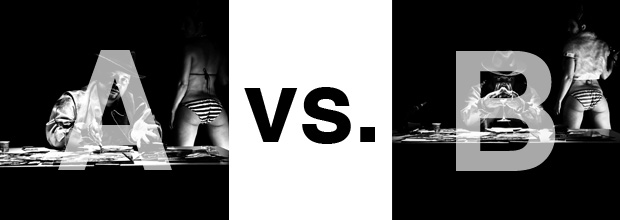
At the end of the show, I shot the cover for his upcoming album, live, online. Here are the results.
The lead one that shows his face is my fav, but there’s plenty of debate, because the other shot is tough and mysterious. I’ll resist the temptation to make any real case for one or the other, and I’ll let this is a straight up survey – which photo do you like better A (top) or B (bottom)? (please answer in the post, not via other social channels so we don’t have to chase your feedback – thx!)
Here is photo A:

Here is photo B:

Thanks for your input.
||And if you missed it: Here’s the chasejarvisLIVE episode with Mix||


")


Not that it matters at this late point, but I just saw the story.
My first reaction to B was that it looked like he had fingers up his nose. After I scanned the reviews and someone said it was a glass I had to go back and look – and NOW I see it is a wine glass. But it isn’t very defined and is a position on his face that it isn’t clear at first. I guess if you want people guessing and having to look hard at the image to tell what it is, then it is OK.
i would go for B
Both are equally great depending on what the original assignment was based on the client’s objective. I choose the photo that was chosen because of the mood of the client at the time the client looked at each photo… Both are equally impressive!
Personally, my favorte is B! 😉
A is better by far, cleaner and more pwerful. A draws you right into his face with open hands and head tilt capturing your attention and then sending your eye along their diagonal lines off to the girl in the corner. Girl is also better in A. Girl’s shirt and face are a distraction in B, as is the clutter on his desk, because of the higher and wider angle in B.
“A” for sure