

Alrighty. Regardless of the fact that this A or B series (here, here, and here) has been really interesting for us, helpful, and popular with you (the last such post received over 1000 comments in 24 hours)…
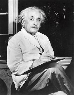
This time it is of even greater interest for us. You see, we’re doing some image editing around here and we’ve stumbled into a little internal debate about which one of these two images is actually better, A or B. [You might remember these shots from the Nikon D7000 campaign…]
Hearing from you will help really help us. No qualifiers, don’t worry about our objectives, or the “assignment”. We want to know which one of these shots you like better. And please tell us in the comments below, not via twitter. Raw preference. Period. If you can add some “why”, that would be nice too. Full 600 pixel wide images after the jump. Hit ‘continue reading’ below [and btw, I’ve got a $1 gentlemen’s bet riding with Erik about which one will win, so don’t let me down!]…
After you all weigh in, I’ll tell you which one I like, which one I thought you’d like, and why.
This is image A, below:

This is image B, below:

So which photo is better? A or B?


")


The exercises for this Gym are set to Members just. To display them here, adjust the Gym Privacy Settings about Beyond the Whiteboard to Show WODs to “Everyone.”
Simply a tip on formatting. I did some tests myself and found PNG to become the better structure for Facebook. Reason being the image is truly the only compressed once (by Facebook) instead of them compressing an absolutely compress image (jpeg).
Thanks for another informative blog. The place else may just I get that kind of information written in such an ideal manner? I have a project that I am simply now working on, and I have been on the look out for such info.
An impressive share, I just sent your stie to my friends to check it out.
A : Its has got a drama in the lights and shadow. B is like a point and shoot.