

A while back I had Grammy Award Winner, Sir Mix-A-lot on chasejarvisLIVE. The guy is smart – dropped some pretty serious knowledge on the show [here’s the re-watch if you missed it].
At the end of the show, I shot the cover for his upcoming album, live, online. Here are the results.
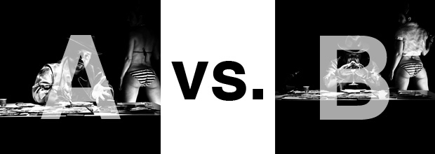
The lead one that shows his face is my fav, but there’s plenty of debate, because the other shot is tough and mysterious. I’ll resist the temptation to make any real case for one or the other, and I’ll let this is a straight up survey – which photo do you like better A (top) or B (bottom)? (please answer in the post, not via other social channels so we don’t have to chase your feedback – thx!)
Here is photo A:

Here is photo B:

Thanks for your input.
||And if you missed it: Here’s the chasejarvisLIVE episode with Mix||


Photographically I really enjoy B and it is a better photo.
But for an album cover A is the right choice. It reads like a Sir Mix-A-Lot album cover.
Though the (A) photo has the telltale signs of what makes any portrait a good one (the well-lit facial expression, the ever-present but anonymous booty-beauty that solidifies what the subjects daily grind is all about), the height and crop of of photo (B) gets me every time. its my favorite style of landscape oriented portrait; the one that looks like a still from a very important piece of film that is centered the subject. Granted, while the (A) photo may be considered by most as “technically” correct, photo (B) has a cinematic quality that cannot be denied. I think it would have worked a bit better with the model being in the same stance and respective point in the frame as on the first photo, but nevertheless, I like the second photo a lot more.
Though the (A) photo has the telltale signs of what makes any good portrait a good one (the well-lit facial expression, the ever-present but anonymous booty-beauty that solidifies what the subjects daily grind is all about), the height and crop of of photo (B) gets me every time. its my favorite style of landscape oriented portrait; the one that looks like a still from a very important piece of film about the subject. Granted, while the (A) photo may be considered by most as “technically” correct, photo (B) has a cinematic quality that cannot be denied.
A
less info is more. A is direct. B confuses. the situation photo-ed in A is intriguing enough for me. I’ll make up my own story to go along with it.
B.
Love the intensity in the eyes, the glass covering the face creating intrigue, and the fingers engaging the viewer with the pointing.